Société Réaliste, czyli Ferenc Gróf i Jean-Baptiste Naudy, to paryski kolektyw tworzący sztukę zaangażowaną społecznie. Na wystawę w lokalu_30 przygotowali projekt skonstruowany w formie dialogu dwóch pełnometrażowych filmów: „The Fountainhead” (2010) oraz „A Life to See” (2012). Obydwa filmy poruszają tematykę charakterystyczną dla Société Réaliste: od mitów i ideologicznej walki w sztuce i architekturze, aż po kanoniczne podejście do estetyzacji polityki.
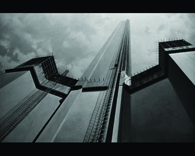
„The Fountainhead” jest footagem filmu z roku 1949 o tym samym tytule, opartego na drugiej powieści Ayn Rand, amerykańskiej pisarki rosyjskiego pochodzenia. Film ten wyreżyserował King Vidor, a w głównych rolach wystąpili Gary Cooper i Patricia Neal. Przedstawia historię modernistycznego architekta-indywidualisty Howarda Roarka (którego pierwowzorem był Frank Lloyd Wright) walczącego z otaczającą go dekadencją w imię geniuszu. Film był odpowiedzią na nazistowskie i sowieckie filmy propagandowe okresu przedwojennego. Scenariusz osadzony jest w Nowym Jorku, przedstawionym jako wyidealizowane kapitalistyczne miasto. Kilka lat później Rand dokonała syntezy swojego ujęcia ideologii kapitalizmu w ramach „obiektywizującej” teorii, której globalizujące i wojownicze założenia znalazły wiernych wyznawców, jak np. Ronalda Reagana czy Alana Greenspana. Usuwając z filmu dźwięki i postacie Société Réaliste pozbawiło film fabuły, redukując go tym samym do czystej architektury poddanej ideologicznym manipulacjom. Nacisk położony został zatem na atmosferę filmu, fantazyjny portret Nowego Jorku, wizualny dyskurs architektury zamkniętego świata – szklanych wież finansowych potentatów.
„A life to see” jest 885 768 godzinnym filmem online opartym na dorobku nazistowskiej reżyserki Leni Riefenstahl. W swojej karierze nakręciła i opracowała ona 10 godzin 1 minutę 19 sekund i 10 klatek filmu. Żyła 101 lat i 17 dni. Na projekt składa się cały materiał filmowy nakręcony przez żyjącą 101 lat Riefenstahl. Czas trwania filmu odpowiada długości jej życia, a każda z 901 985 klatek pojawia się tylko raz, na 59 minut. Artyści wykorzystali też kompletną, trwającą 601 minut ścieżkę dźwiękową z filmografii niemieckiej reżyserki, uporządkowaną chronologicznie i skondensowaną do 59-minutowej sekwencji, powtarzającej się przy każdej z klatek. Projekcja online rozpoczęła się 17 lutego 2012, a zakończy się 7 marca 2113.
Obydwa filmy spajają charakterystyczne dla Société Réaliste inskrypcje pisane czcionką Futura Fraktur, która powstała w 2010 roku z połączenia dwóch czcionek zakazanych w Trzeciej Rzeszy. Futura jest archetypem modernistycznej typografii, stworzonym w 1927 roku przez Paula Rennera przy użyciu elementów wizualnych wprowadzonych przez Bauhaus, a zakazanych przez nazistów. Z kolei Fraktur to gotycki krój pisma używany w krajach niemieckojęzycznych od XVI do XX wieku. Uznany za rdzennie niemiecki, krój był chętnie wykorzystywany przez nazistów aż do 1941 roku, kiedy to został oficjalnie zakazany przez Martina Bormanna ze względu na domniemany żydowski charakter i związki z czcionką Schwabacher.
______________________
EN
SOCIETE REALISTE
KOMFORTKAMPF
Video, inscriptions
Following the invitation to present its recent work at Lokal 30 gallery, Société Réaliste has devised “Komfortkampf”, an exhibition constructed as a dialogue between two long-feature films of the Paris-based cooperative: “The Fountainhead” (2010) and “A life to see” (2012). The two films address crossed topics between promethean myths and ideological belligerence in the field of art, a certain canonical approach to the aesthetization of politics.
Ayn Rand (1905−1982), Russian-born American novelist, made a film adaptation of her second novel “The Fountainhead” in 1949. The studio movie was directed by King Vidor and featured Gary Cooper and Patricia Neal in the main roles. The movie tells the story of Howard Roark, an individualistic modernist architect − a character based on the figure of Frank Lloyd Wright − fighting against a surrounding collective decadence in the name of his personal genius. This original movie is a propagandist response to the Nazi and Soviet films of the pre-war period. At the centre of the script emerges the city of New York, seen as the idealized incarnation of capitalism. Few years later Rand synthesized her zealous embracement of the capitalist ideology in her “objectivist” theory, a willingly globalizing and militant concept followed by numerous admirers such as Ronald Reagan and Alan Greenspan. With the aim of deleting the plot of the original version Société Réaliste has removed the sound and every human presence from their version of “The Fountainhead” to reduce the film to its decorum, its ideological architecture. It’s all about the atmosphere of the film, the fantasized portrait of the city of New York, the visual discourse on the architecture of a closed world, the glass tower of the titans of capitalism.
“A life to see” (http://alifetosee.net) is a 885,768 hours-long online film based on the film production of Nazi director Leni Riefenstahl. Throughout her career, Riefenstahl has shot and edited 10 hours 01 minute 19 seconds and 10 frames of motion picture. She lived for 101 years and 17 days. “A life to see” is a film composed of the 901,985 frames authored by Riefenstahl, edited in order to last the same time as her life, 885,768 hours. The frames are projected randomly and each of them appears only once, for a duration of 59 minutes. The complete 601 minutes soundtrack of Riefenstahl’s filmography is edited in its chronological order and accelerated to an overall duration of 59 minutes, repeated over each frame. The projection of the film began on Friday, 17 February 2012 and will finish on Tuesday, 7 March 2113.
The two films are related one to the other with a series of graphic works extracted from Société Réaliste’s corpus of work.
Futura Fraktur (2010) is a hybrid of two typefaces banned under the Third Reich. Futura is the archetypal modernist typography, invented by Paul Renner in 1927 using visual elements introduced by the Bauhaus, hence their ban by the Nazis. Fraktur is the Gothic-style typeform used in German-speaking countries between the XVIth and XXth centuries. Considered authentically Germanic, Fraktur was the preferred typeform of the Nazis until 1941, when it was officially banned by Martin Bormann, under suspicions of Jewishness because of its origins and links with the Schwabacher typeface.